OPAF Web Experience
Optimizing for increased user engagement and conversion
The client requested an updated overall look and feel of the Otsuka Patient Assistance website with a strong UX eye. A redesigned website that helps patients looking for assistance and support in paying for their medication. The goal is to make this a more user-friendly platform and simpler when it comes to its pages and paths with a special emphasis of a new experience for the the web tool that supports checking the eligibility of a patient through a quiz-like process.
5 months
UX Designer
Scroll Down

The clients were unhappy with their current website as they noted that many of its users were unsatisfied with the user experience of the site. The web experience was not optimized for users on the go in terms of both content and audience. Issues such as poor way finding on pages and the checking the eligibility web tool process provided more difficulty in the user journey through the website. As the sole UX Designer, I helped define usability issues, provide user-centered solutions that redesigned the way patient users interact with the website with specific emphasis on the experience of the eligibility web tool.
The Approach
While the website was small, only containing only three main navigation titles there were still a number of issues with completing tasks successfully. This was a matter of poor writing and information transparency. With a UX Writer, pain points were identified as being misleading such as where a button would go and the actionability of texts. The Eligibility tool was redesigned to present all steps and selections clearly and more visibly with the addition of symbol signifiers representing completed, current, and unselected. The tool functions in an auto-scroll.

Design Process


Research
Site Content Audit: Documenting the content pain points and locating faults in the user experience
As part of the kickoff for this project, an audit of the website’s UX was conducted and tested to gather where the pain points were being experienced. This exercise went through each page and was useful in understanding the necessary actions that would be taken to improve the digital experience.

The eligibility tool experience in itself required too much clicking in for such a short process. Every step required the action of filling out the needed information followed by the action of having to tap or click the 'Next' button. This additional button to advance posed a user issue especially as it elongated the time spent on the tool when it should be seamless.

The focus of this redesign is to establish what content is solely for HCPs and what is for patients. The eligibility tool is the most important aspect of the website that needed to be updated as that was expressed to be the most disappointing experience. After an audit of the UI flow on desktop, it was also discovered that this flow is not properly optimized for mobile.

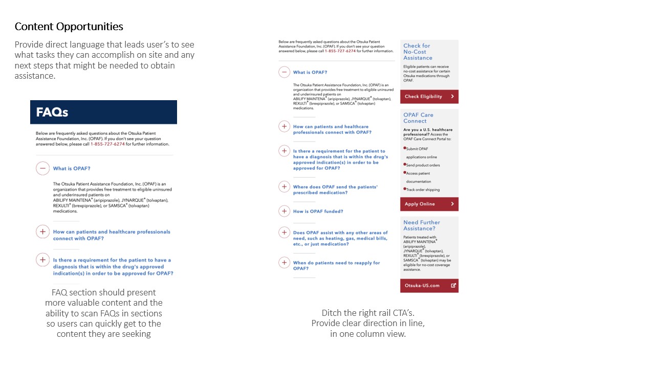
There was an opportunity to do away with poor design on the entire site that alters the UX experience such as removing the right rail which proves to be an obstruction to the focal content as seen on one the pages. Thus, taking away competing information and content that can put strain on the user as to where they should be looking or what they should be reading.
Ideation
Make the experience on mobile extend to desktop
The then current web flow and site design were not functioning properly on mobile view. It was crucial that the redesign were to put mobile first especially as most people are viewing these content on a mobile device. It was made mobile ready by having the steps in the web tool auto-scroll to the next step after completion not still allows user to scroll up or navigate to previous completed steps.
- The autoscroll guides users to the next step, rather than have the user click 'next' to advance to the succeeding steps.
- Because 2 steps requires text input, an inactive button would be displayed and to go forward the user would have to fill text field in order for the button to be active which they would then tap/click. Autoscroll here wouldn't work because user has to enter manually the information which can come with errors so by doing this or provides space and time for user to correct or think over their answer before submitting
- Removed unnecessary and redundant interactive content such as the household members graphic

Design
An optimized mobile and desktop experience that is engaging and satisfying to users
When users are using the tool, their entire attention and any decision they make should be actionable. The web tool was designed to assist the users to overcome any redundant or time-consuming questions by guiding them to completion not more confusion. The autoscroll ensures that they reach the next point in their journey to getting answers.

But how would the user go back if they wanted to change their answer or made an error?
This was an answered posed by development which was a fare question to ask. The completed steps would flow or scroll underneath the introductory content on top of the tool feature for the desktop while it would remain on screen for mobile but collapsed. That way the user could scroll on desktop to return to a step while on mobile they would be able to tap the step on screen.

Treating multiple choice and text fields differently
Not all information asked of users was treated or formatted the same. Steps that had content with definitive or limited answers were treated with multiple choice while steps that required customized or personal information were treated with a text field so users could enter their answers. And rather than automatically scrolling to the next question, they had to tap or click a button that would advance them to the next step or destination in their journey.

In mobile, the tool encompasses the entire but the actionable items are dominate the the screen so users know what UI is interactive. The micro-interactions (autoscroll, selecting a button, step check mark turning green) provide feedback when completed and in a more prominent way.


Takeaways
While the website was small, only containing only three main navigation titles there were still a number of issues with completing tasks successfully. This was a matter of poor writing and information transparency. With a UX Writer, pain points were identified as being misleading such as where a button would go and the actionability of texts. The Eligibility tool was redesigned to present all steps and selections clearly and more visibly with the addition of symbol signifiers representing completed, current, and unselected. The tool functions in an auto-scroll.
Website is set to be developed and launched live for 2020.