UPNEEQ - Utilizing AR technology to treat and track changes in patients with droopy eyelid
Optimizing for increased user engagement and conversion
UPNEEQ stands out as a groundbreaking iOS application designed for both tablets and mobile devices, employing augmented reality (AR) technology to measure and track changes in droopy eyelid conditions—a pioneering concept with no parallel in the market. In my role as a UX and product designer, I dedicated 9 months collaborating with two developers and another product designer to conceptualize, execute, and bring to life this innovative iOS application.
Client: [Redacted] Pharma Company
Role: Product Designer, Interaction Design, Wireframes, Prototype, App Map
Scroll Down

Tasked by a major healthcare company, our objective was to launch a new eyedrop alongside an application capable of tracking changes in eyelids affected by acquired blepharoptosis or droopy eyelids.
The Approach
Crafting a straightforward tablet iOS application utilizing AR technology, Upneeq masks and calculates facial features from before-and-after photos taken in selfie or rear camera mode. The application facilitates easy sharing through an export feature, sending results directly to the user's email.
Tools:
Sketch, iOS System Design, Zoom, Marvel
Categories:
Product Design, User Experience, User Testing, Wireframes, Prototyping

Ideation
Focused on clarity and user guidance, a linear experience was devised where users tap to initiate the process, guiding them through app usage, photo capture, and result visualization.

User Testing
With the wireframes completed, the screens were sent to the development to add the augmented reality component of the rainbow face mesh that would overlay on the face as the user is taking their photo. A live working prototype would be used in the user tests to validate some of the experience and design concerns. The objective was to see how many professionals would like use the application in their practice and what are the pain points that they encounter?
Scope: 4 Days
User Tests: 9 Eye Care Professionals
Session length: 1-hour remote virtual sessions
Due to COVID-19, the sessions were moved to the virtual space while a member of our team acted as a proxy user who mirror the actions the user instructed they were to take as we went through the screens and entire app experience. While the physical product may have not been in the user's hand, they were still able to communicate their thoughts and feelings about what they perceived on screen and whether the delivery of information made sense to them.
Synthesis
Positive reactions were had in response to their user of the product. And many users did say they would use the application and even recommend to fellow colleagues as it could come in good use in their interactions with clients that have droopy eyelid.
Major Insights
01 Majority of testers called attention to the fact that they would most likely use this on tablet rather than their phone because tablets are standard office use while the phone is their personal item.
02 Users suggested adding a rear camera mode because some patients may not be able to take a selfie due to age or poor eye sight.
03 The tutorial page was not clear enough of what they will need to do to and what will happen.
Overall, users understood the purpose and functionality of the application. It was a product that they would likely use in their practice but there were some areas during testing that they pointed out could be improved or cause them confusion.
These insights were very useful in improving the app and some of it features. The final design would have to provide room for the possible scenarios that are likely to occur in the eye care office such as someone not being able to take their own photo and designing a launch of this product on a larger device such as a tablet.
Instead of continuing to design for mobile, gears were shifted to adapt this to tablet which means that the product experience woulf be slightly affected due to the change in device screen and size which posed its own design hallenges.
The Design
With insights pulled from user testing user flows for the app could finally be drafted and decided upon. The core of the app experience is taking a before and after photo. After taking the user feedback from the testing sessions, the functionality to choose between a 'selfie' or 'read facing' camera selection was added to the product map. Below displays the flows users may embark on depending on which camera they select.

Tablet Wireframes
Responding to user feedback, the design shifted from mobile to tablet, accommodating the larger screen. Core functionality remained consistent, necessitating adjustments to layout and the addition of an export feature, prompting user-entered email information.
The functionality remained the same but the layout of several screens changed due to excessive whitespace if the mobile layout was directly transferred on there. The solve was to use a background photo to fill up the tablet screen while placing the already locked up mobile layout in the center of screen. This way there would be no need for a huge design lift. Text and buttons increased only slightly but the style guide remained largely the same.
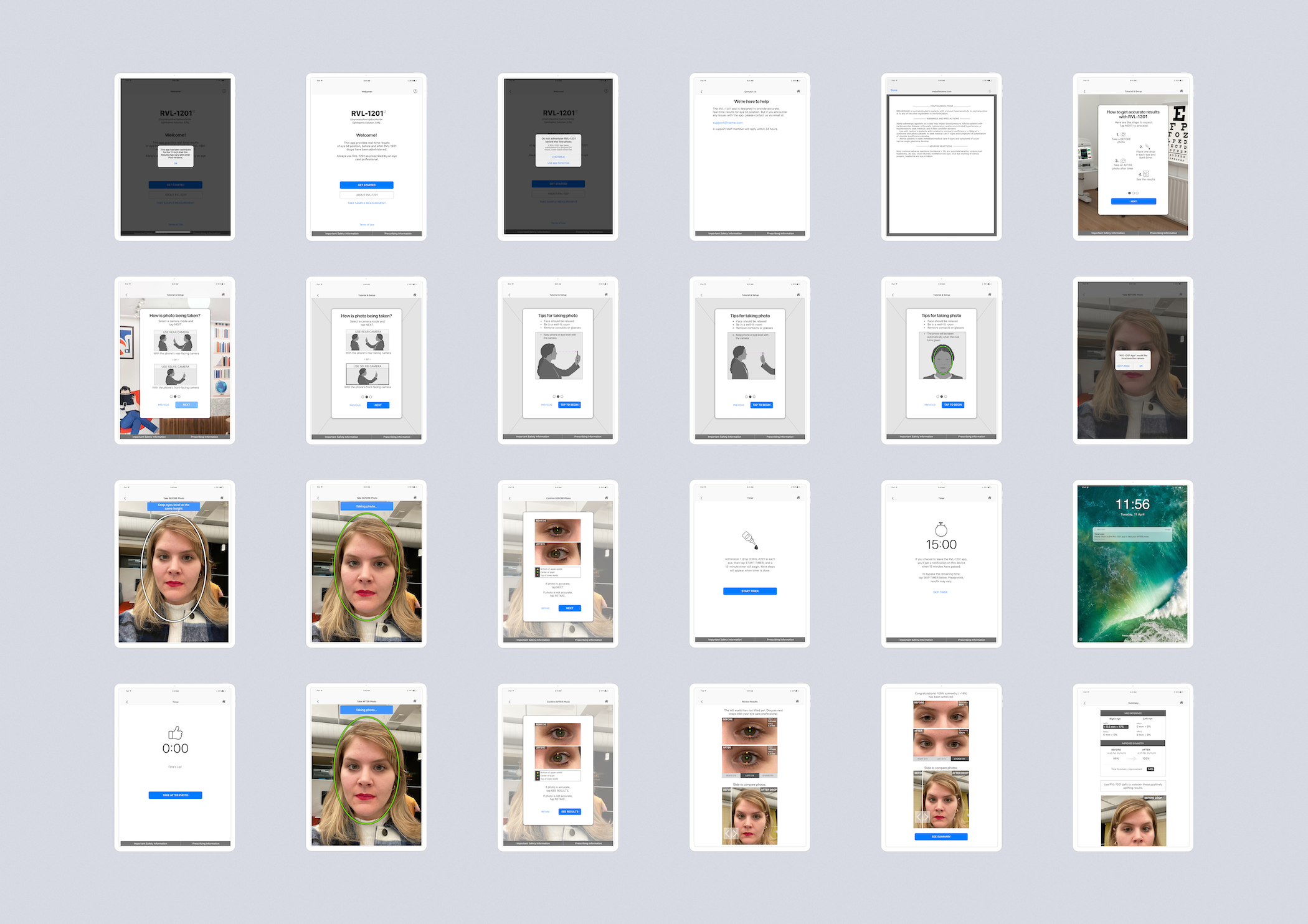
There was also the addition of a new functionality: an export or share feature. The export would prompt a form with 3 required text fields and would not export unless filled out. This would allow the user to export the summary page with chart and photos to the user's email address. The solution was add an email settings page in which the user could input their email at the launch of the app or during the export process upon tapping "Export" on the summary page.
Product Design
Camera Selection
Users choose between selfie and rear-facing camera with an informative tutorial screen

Photo Capturing
Tooltips guide users in capturing accurate before-and-after photos

Results
View changes in eyelids through slider/tabs

Export
Users share summary and photos via email, entering required information for export

App Map
The final map of the application detailing the function and navigation of actionable links, buttons, and processes.

Prototype
The application is still in development so using the wireframes created for tablet I produced a functioning prototype in Marvel that contains all current tasks a user could take and the journey flows that a user will experience while using the application. Unfortunately, the prototype developed has been archived is no longer accessible to review.
Next Steps
Scheduled for release in Fall 2020 on Apple's App Store for iPad Pro 11', the product aims to explore additional features post-launch, such as sample tests and potential expansion to mobile devices.
Reflections:
User testing underscored a preference for iPad use, influencing the decision to prioritize tablet development. The challenge of optimizing for larger screens was addressed by adapting the mobile layout with adjustments to font sizing and the introduction of a background image—a strategic solution to balance visual elements and enhance user experience.