Tensorflow.org - Optimizing for increased user engagement and conversion
Optimizing for increased user engagement and conversion
TensorFlow, a prominent open-source software library for machine learning and artificial intelligence, faced usability challenges on its landing page. The existing design proved ineffective for its primarily developer and information researcher audience, hindering their ability to swiftly access necessary information. The identified objective was to not only provide a visual facelift but fundamentally transform the user experience.

The initial state of Tensorflow's landing page posed challenges for developers and information researchers seeking efficient navigation. The goal was to revamp the visual design and streamline the user experience to prioritize task-oriented actions.
The Approach
User Research
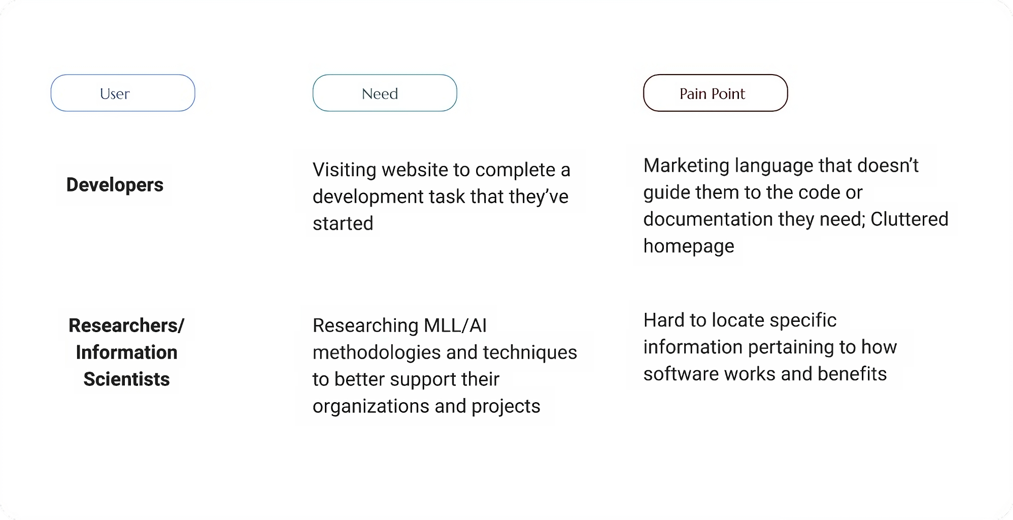
Conducted user research to understand developers' preferences, emphasizing a task-focused approach over marketing content. Identified primary users as developers and secondary users as researchers and information scientists.

Strategic Focus Areas
Crafting an experience to surface relevant resources
Task First:
Emphasized a task-centric strategy by prominently featuring call-to-actions related to key tasks such as preparing data, building ML models, deploying models, and implementing MLOps. This approach aimed to cater to users searching for specific tasks.

Emphasize Offerings:
Highlighted Tensorflow's diverse offerings beyond libraries and documentation, including community spaces, contributions, education, and news. Provided sources for staying updated through interest groups, GitHub, courses, and social media.

Enhance Scanability with Minimalism:
Redesigned the page for improved scanability, reducing text density, and introducing customized illustrations. Utilized white space to enhance visual appeal and ensure call-to-actions stand out.
Provide Direction & Encourage User Action:
Created a module to guide users who may be unsure where to start, offering pathways for learning Tensorflow basics or installing the software. Addressed various user behaviors and journeys.

Keep it Visible:
Prioritized visibility by avoiding information hidden behind tabs and ensuring the redesigned page aligns with user goals, especially when users have specific tasks in mind.
Design
Developed wireframes based on Google Material Design components, incorporating elements from the UX strategy. Collaborated with a visual designer to add branding and illustrations, ensuring accessibility and consistency across mobile and desktop.

Refining Visual Design
When the wireframes were in a good place, a visual designer added the branding and illustrations to the design to being it to life. I worked with them to ensure color styles were accessible and that type styles were carried throughout the designs on mobile and desktop. There was originally a lot more orange (the brand color) in earlier designs but was able to come to a compromise in applying the more lightly.

Additional Challenges
Encountered challenges, including the initial desire for an interactive code manipulation module, which was deemed out of scope. Opted for GIFs as a compromise. Addressed users unsure of where to start by incorporating a module with relevant CTAs.
Outcome
The redesigned Tensorflow landing page prioritizes a task-first approach, catering to users searching for specific actions. It offers a cleaner visual and experiential design, along with pathways for users with varied needs, enhancing overall usability and satisfaction.